FEATURES OF BOOTSTRAP 4
By ADMIN| May 21, 2018
CATEGORY : BLOG | BLOG DYNAMIC | DEV | WEB DESIGN
TAGS :
Bootstrap is one of the most popular front-end frameworks among web designers. It had recently launched its 4th version. Let’s take a look at its features.


 Flexbox provides simpler and more flexible layout options in CSS. As per B4:
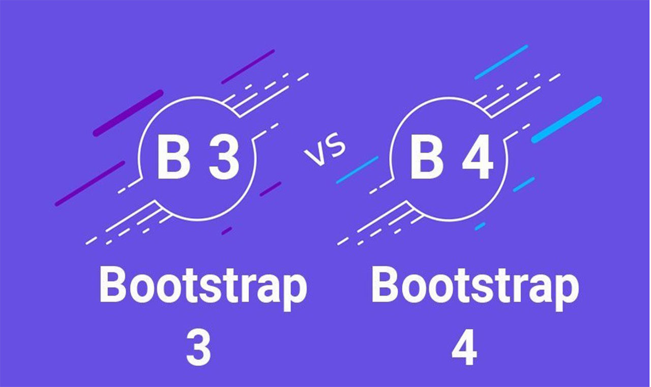
Comparing Bootstrap 4 with bootstrap 3:
Enhanced Grid System:
In Bootstrap 3 there are specific classes to target an element on different screen sizes via pixels but in Bootstrap 4 the new smaller (-sm) tier is a better option to target mobile devices. This time it’s in rem (for typography) and em units instead of pixels. Dropped IE8 support:
If IE8 is necessary, you can use bootstrap 3 but dropping support for IE8 provides the advantages to use the best parts of CSS without any trouble with CSS hacks or fallbacks.Shifting to rem and em units:
Pixels have been swapped for rems and ems which is much more appropriate to make responsive typography and component sizing easier. Using of Cards:
Cards replace Bootstrap 3’s old panels and wells which are much more flexible and used as an extensible content container. It includes options for headers and footers, a wide variety of content, contextual background colors, and powerful display options. From Normalize.css to Reboot.css:
Bootstrap 3 uses Normalize.css as its CSS reset. Bootstrap 4 uses Reboot.css file. Reboot was built upon Normalize.css and it’s a collection of element-specific CSS to provide a simple baseline which are styles using only element selectors.Rewrote all our JavaScript plugins:
Every plugin has been rewritten in ES6 so that the newest JavaScript enhancements can be used to the fullest. They are available now with UMD support, generic teardown methods, option type checking, and a lot more. Opt-in flexbox support:
To enable flexbox you have to set $enable-flex boolean true in the _variables.scss file. After recompile all grid components will use Flex Box. Cool.Flexbox provides simpler and more flexible layout options in CSS. As per B4:- Vertical alignment of content within a parent element.
- Reordering of content across devices and screen resolutions with the help of media queries.
- CSS-only equal height columns for your grid-based layouts.

Difference between Boostrap 3 and Bootstrap 4
- In Bootstrap 3 .responsive-table class must be added to a parent <div> element whereas in bootstrap 4 it can add .responsive-table to the actual <table> element.
- In Bootstrap 3 there are .btn-default and .btn-info classes. The .btn-secondary class isn't there. Bootstrap 4 introduced the .btn-secondary class and removed the .btn-and btn .info-default classes.
- In Bootstrap 3 custom forms not supported whereas Bootstrap 4 introduced complete custom form elements that replace the browser defaults.
- The .label-pill class is not available in bootstrap 3. However, Bootstrap 3 have badges.